I made various smaller UX improvements to Audit Template as and when the resources were provided.
1. Visualization Enhancements
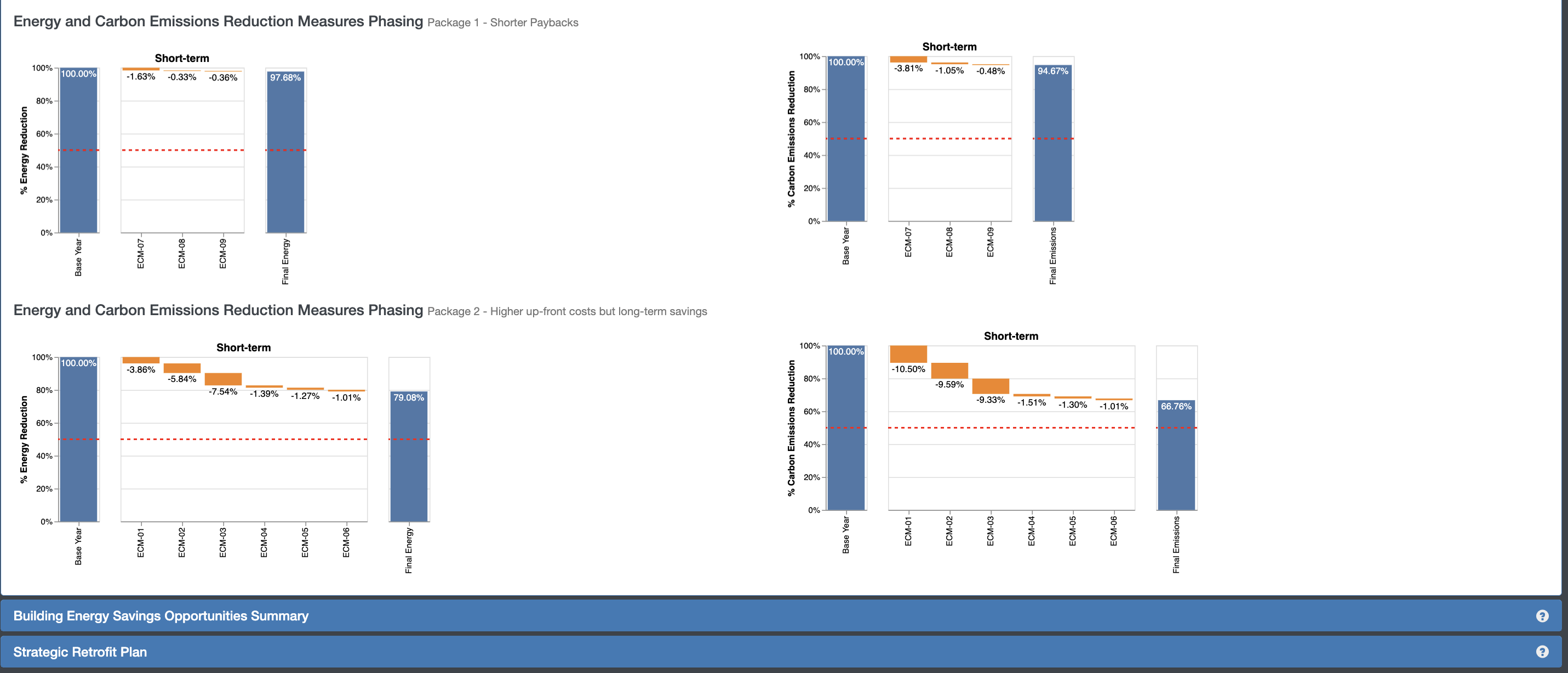
I enhanced the Audit Template interface by introducing data visualizations to help users interpret project performance results more intuitively.
The new visuals displayed carbon trajectories, measure-by-measure comparisons, and other key performance indicators, making it easier for users to evaluate the impact of energy conservation measures over time.
(Detailed project requirements are mentioned in Building Performance section)


2. Customized Report for 179D Tax Rebate (Alternative Pathway)
To support projects pursuing the 179D tax rebate through an alternative compliance pathway, I designed a customized Audit Template report that presented energy savings, baselines, and qualifying metrics in a clear, reporting-ready format.
This update streamlined compliance documentation for users while aligning the workflow and output structure with federal reporting requirements.
3. Low-fidelity Dashboard Wireframes
This task warranted some quick low-fidelity wireframes for a jurisdiction dashboard to view some stats for their projects. It needed to be handed off to the software developer simply for a feasibility assessment of the implementation. It was a 30 min quick effort. This was the beginning of a collaborative effort with comments between me and the Project Manager in Figma to identify future scope when it’s time to create detailed prototypes.

