
Overview
The Quick Building Assessment Tool helps users identify and evaluate Energy Conservation Measures (ECMs) for different building systems. The tool’s selection interface was based on legacy code that restricted layout flexibility and provided a poor user experience. I led the redesign of the modal dialogue box to make ECM selection more intuitive, visually engaging, and informative within the technical constraints.
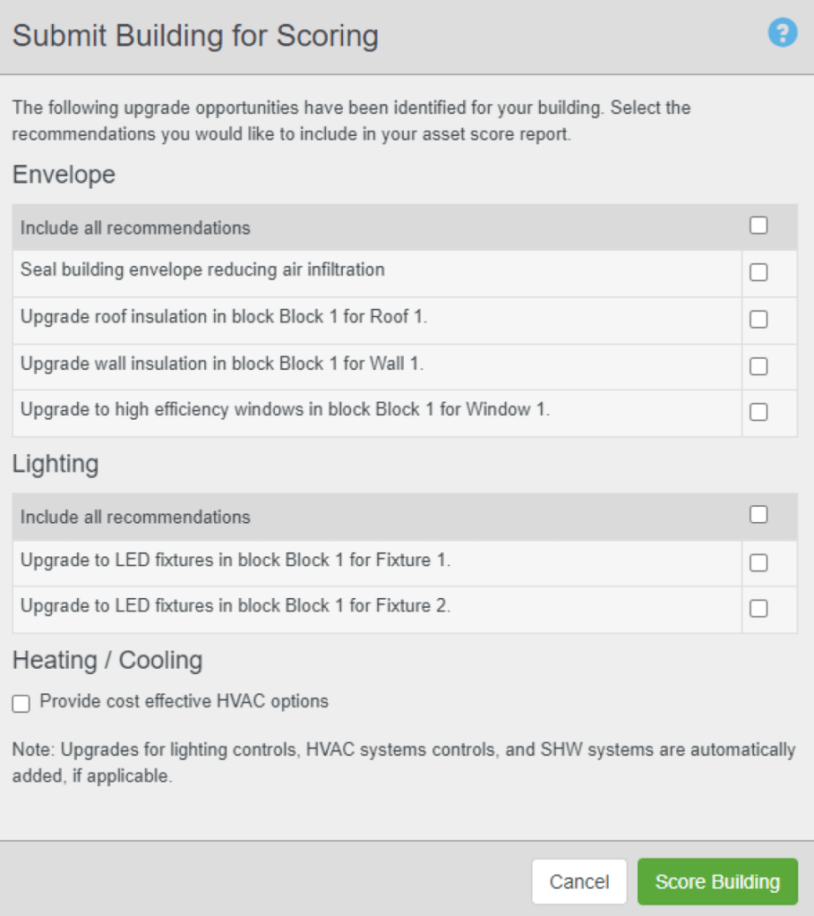
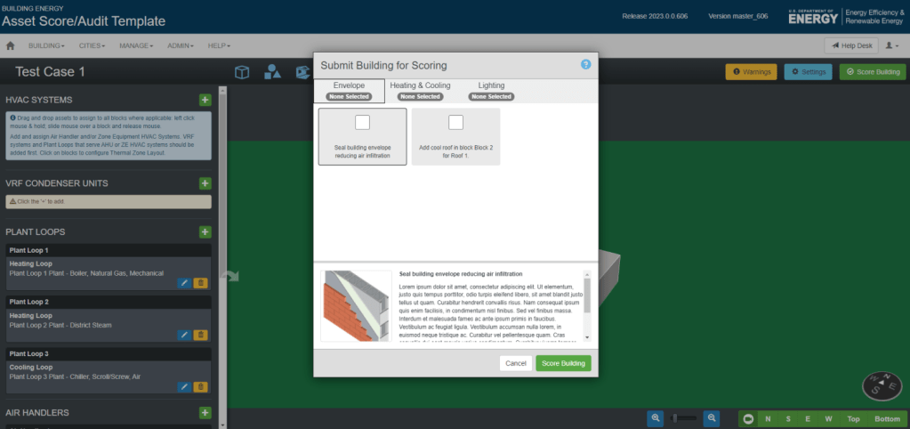
Problem Statement: The original modal dialogue box was difficult to use:
- It was fixed in size due to outdated code, limiting how information could be displayed.
- Each ECM was shown as a single-line heading, making it hard for users to understand what each measure actually did.
- Because of its limited usability and aesthetics, the modal was shown at the end of the workflow and largely overlooked.
The project manager wanted a version that allowed for descriptive content, direct links to resources, and a more modern, user-friendly interface.
My Role
As the UX Designer, I:
- Interpreted the project brief and gathered design requirements from the Project Manager.
- Created multiple wireframe options exploring different layouts and information hierarchies.
- Collaborated closely with the software developer to test what was feasible within legacy code constraints.
- Designed the final interface, including custom icons, descriptive text, and improved navigation and layout.
- Delivered detailed visual assets and design specifications for implementation.
Process
I started by analyzing the existing modal and identifying information hierarchy issues. My goal was to make it easier for users to browse ECMs quickly while still providing access to details when needed.
STEP 1: The first step was creating a reference/mood board to research different modal designs in other tools to take some design inspiration.

STEP 2: Then, I created a series of low-fidelity wireframes showing different ways to present ECMs, balancing readability and technical feasibility. Multiple alternatives were provided in 2 major categories – 1. If we stick with the same legacy code modal dialogue box, 2. If we go with a separate window that opens in a new tab.
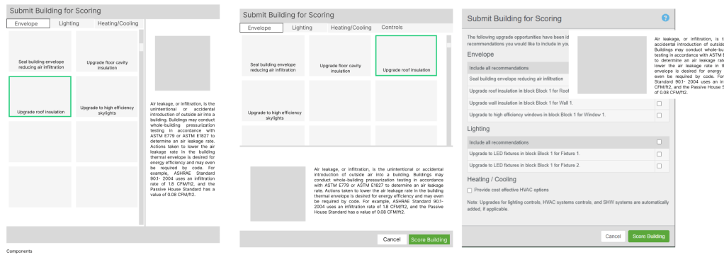
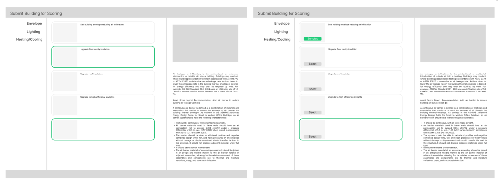
STEP 3: After review sessions with the Project Manager and developer, we selected the option that used the same legacy modal dialogue box, allowed easy measure selection, showed ECM descriptions at the bottom and compact iconography for faster scanning.
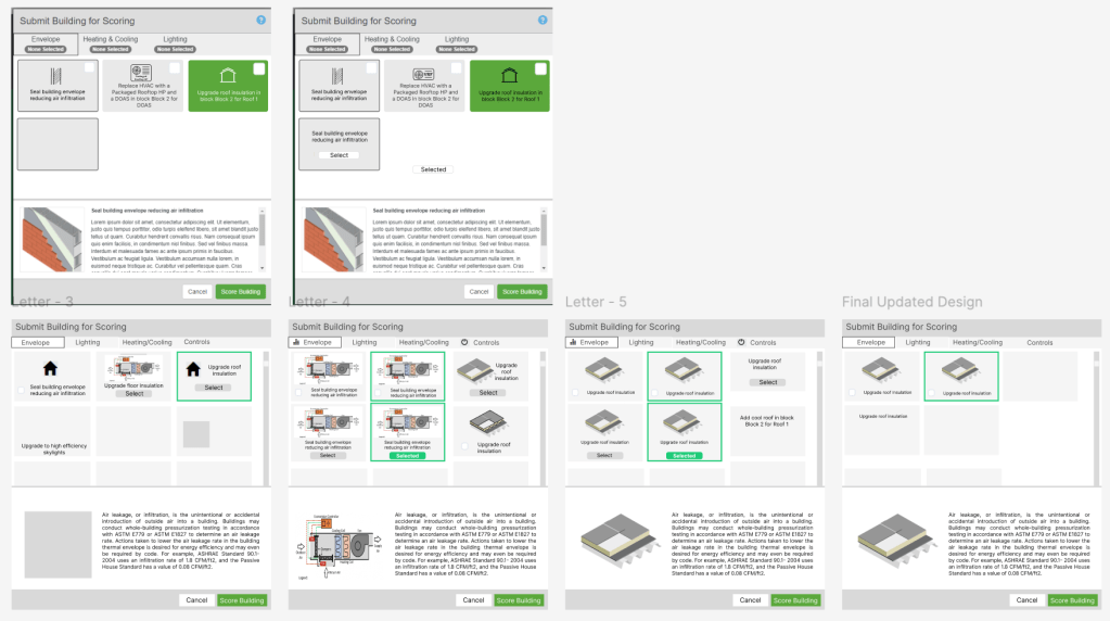
Once feasibility was confirmed, I moved to high-fidelity design, introducing:
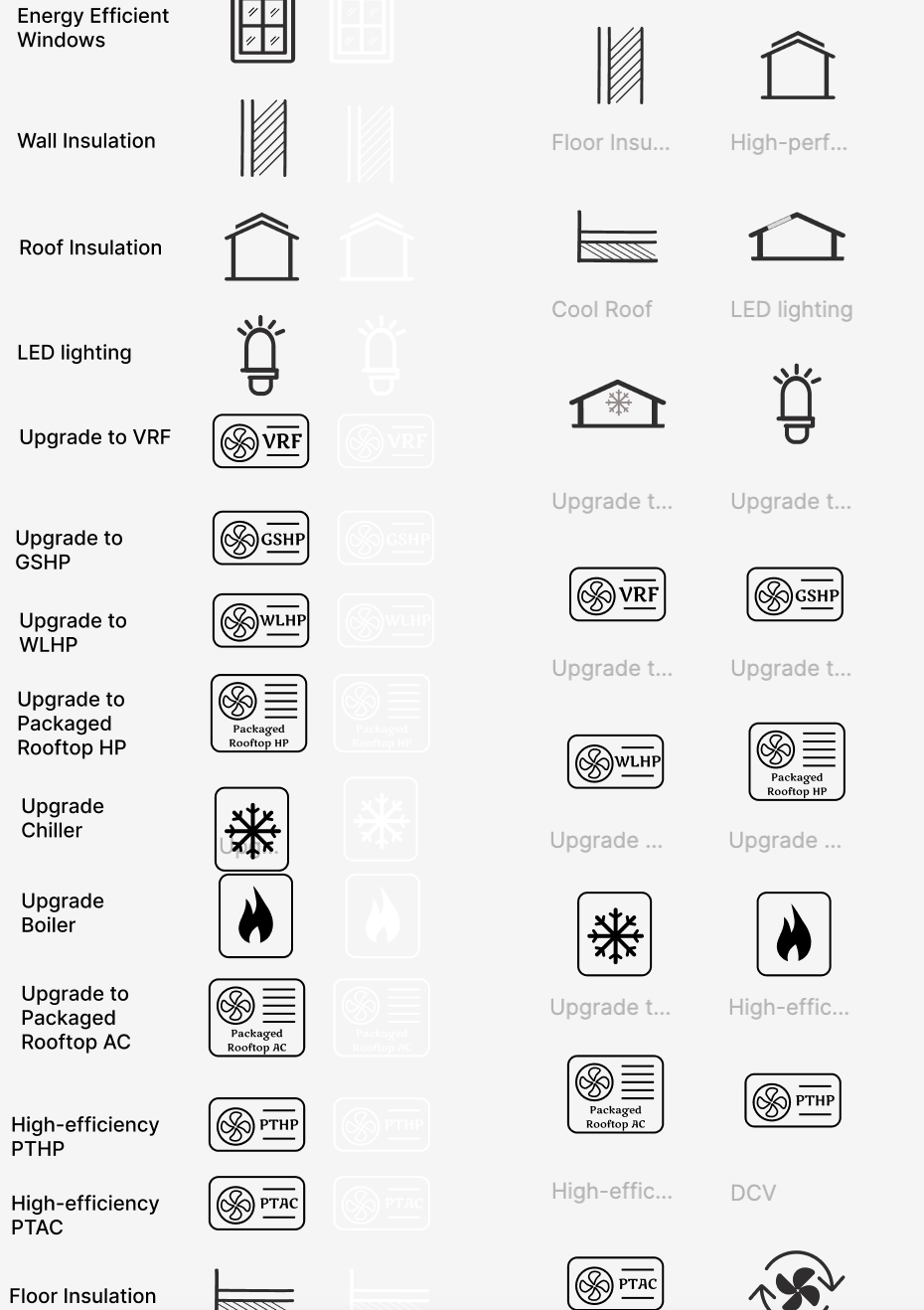
- A structured layout with clear typographic hierarchy.
- Custom-designed icons representing each ECM category.
- Refined text and consistent microcopy (“flavor text”) for clarity and tone.
- An improved navigation workflow that supported smoother browsing and selection.
Tools and Platforms Used
Figma (Wireframes, detailed prototypes, customized icons), Nouns Project (used as a reference site for customized icons), JIRA (to track the tasks), Confluence (Design Documentation and updated descriptive text and links)
Outcome
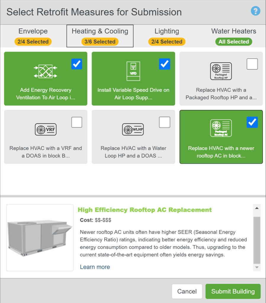
The new modal dialogue box transformed a once-overlooked interface into one of the tool’s most recognizable features:
- Improved clarity – users could now understand ECMs at a glance.
- Enhanced usability – streamlined layout and collapsible descriptions simplified the selection process.
- Stronger visual identity – the redesigned modal became the hero image for the product’s marketing materials.
This redesign demonstrated that thoughtful UX, even within strict technical constraints, can significantly improve both usability and product perception.
Reflection
Working on this project reinforced the importance of designing within constraints and collaborating closely with developers to translate UX goals into practical solutions. By iterating through wireframes and exploring feasible design patterns, I was able to elevate both function and aesthetics without altering the underlying system architecture.
“The redesigned modal became the face of the product – intuitive, informative, and visually refined.”
